
Making a case for digital accessibility
And 5 steps for a quick accessibility fix

Levels of accessibility assistance required (Microsoft 2003)
96.8% of home pages had detected WCAG 2 failures! (https://webaim.org/projects/million/)

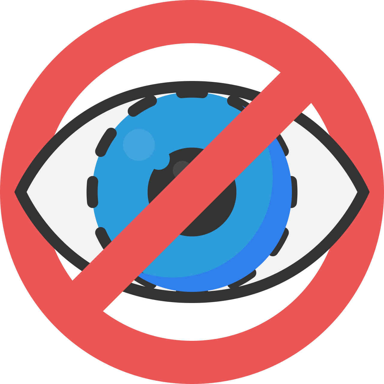
More than 1 billion people with disabilities around the globe have nearly zero access to digital products.
This same population wields market power in excess of £422.38 billion. (https://webaim.org/projects/million/)
That’s a huge number and yet we seem to largely ignore this fact. Making digital products accessible makes a lot of financial sense, why would any business not want to sell its product an extra 1 billion people. Yet this is exactly what happens.
Accessibility errors on website home pages.

Colour contrast, is one of the easiest accessibility errors to fix. There’s hundreds of tools to use, one of my favourite is https://color.cloudflare.design/. You can paste in your website URL and check your websites colours for accessibility. This provides you with the contrast of not just your text, but other elements, such as, forms, buttons and icons.

A full list of colour checking sites and apps are listed at the bottom of this page 👇
More than 4 million abandoned a website because of barriers they encountered
That’s a huge number to factor in. If you relate this to a physical experience of a shop, you just wouldn’t put barriers in the way to stop people buy a product. For example: Making your point-of-sale hidden behind a wall or putting spikes on the floor to make it difficult to get into. We don’t do these things in real-life, yet we accept them in digital experiences. (https://abilitynet.org.uk/)

Worth an estimated £17.1 million in lost sales, in the UK alone, for 2019
The lost sales due to inaccessible e-commerce experiences causes a massive £17.1 in lost sales. With a few minor tweaks and including accessibility early in your development makes good business sense and provides a better experience for everyone.
What can we do?

(in 5 easy steps)

Check your current accessibility score
You can quickly check the current accessibility of your website by running a quick check of some key elements. This helps to measure the progress you’ve made in your accessibility journey, while providing an overview of things that need fixing.
While automated testing gives you a good idea of where to focus your efforts, there’s no real way of checking everything. For this, consult with an expert , such as, https://consultseated.com.

Lighthouse is built into Chrome’s developer tools.

Example accessibility score for Medium.com
Top tools for checking your sites accessibility
Accessibility insights: You can use this tool to check your accessibility of Android apps, websites Windows apps. This tool gives you fixes that take less than 5 minutes.
Lighthouse: Using directly from the Developer Tools in Chrome or by adding the extension made the Google team.

Design everything with at least an AA contrast ratio
Make sure that all the designed elements have a contrast ration, use the colour contrast tools to quickly check accessibility between the background and foreground colours. When using colour don’t use colour alone to indicate the status of something. For example, green text without an icon or explanation will not look green to everyone.
Examples of how colours look with different conditions of colour blindness

Use large fonts
Don’t be afraid of using a large font, this not only helps with accessibility, but increases the readability of a webpage. People don’t read all of your content, they scan pages for relevant and interesting sections. Using large fonts really helps people to scan and find this content. The Neilsen Norman group published the results of a study about how people scan a page, https://www.nngroup.com/articles/how-people-read-online/.
Never use light or thin fonts, light and thin fonts don’t have the same colour accessibility and readability as regular and bold fonts. This also applies to strokes weights and focus states, for an in-depth guide on focus indicators; https://www.sarasoueidan.com/blog/focus-indicators/
Use a minimum size of 16pt, even on mobile devices using a 16pt font helps for a more comfortable read. The last thing you want is for your users to pinch and zoom into text and loose context of are they are in your storytelling.
Avoid using UPPERCASE, uppercase letters may give the UI impact, this is a huge problem for your users with dyslexia. 6.3 million people (around 10% of the UK population) have dyslexia. https://www.gov.uk/government/publications/understanding-disabilities-and-impairments-user-profiles/simone-dyslexic-user
Complex words and abbreviations, not everyone is an expert or knows what an MVP is (Minimum Viable Product or Most Valuable Player, depending on who you’re talking to). The average reading age is 11 in the UK, so maximise engagement by simplifying jargon and only using long, complex words when absolutely necessary.

Use ALT text
(when appropriate)
Where you’re using an image and it’s relevant to the story, social media post, PowerPoint presentation, etc. then it needs an alt description to allow screen readers to describe what sighted people can see.

Common mistakes when using alt tags
Using one of my illustrations I’ve highlighted a few errors that I see when visiting websites.
Using the filename as the alt tag
alt=”stockimage54565494”
This is just nonsense for the screenreader, image listening to this a few hundred times a day!
Not providing a good description
alt=”Data holding a gem”
Not providing a good description can result in an entirely different message over the intent of the image.

Using alt tags on absolutely everything
As a rule-of-thumb, only use alt tags when an image adds to the context of your story or page.
Icons used multiple times and with text beside them shouldn’t have alt tags, instead use alt=” “ or aria=”hidden” so that the screen reader ignores them.
Add to the story
Describe what’s going on in the image, complex images demand more descriptive alt tags, for example:
alt=”Commander Data, from Star Trek, holding a giant gem reflecting a laser beam with padlock icons in the background”

Keep it simple
The average viewing time of a webpage is 15 seconds and that’s for everyone.
If you haven't generated interest in those 15 seconds, then you’re probably not going to.
For top tips on how to reduce your bounce rate (the percentage of people who leave your webpage after viewing just one page):

People have an attention span of around 8 seconds when viewing your website, even less social media (around 4 seconds).
https://time.com/3858309/attention-spans-goldfish/
When we remove barriers and have engaging and relevant content our attention span increases. Netflix has a whopping average of 3.2 hours of viewing a day. So, it’s not all bad news.
However, accessibility frustrations cause people to leave your web page or social media content at alarming rates. And what’s even worse, they’re unlikely to come back.
If you want to watch these tips
5 top tips to All4Inclusion supporters during their digital accessibility webinar.
Colour contrast checking tools
Accessibility Color Wheel: Test and tweak colour choices, simply move your mouse around the colour wheel and evaluate for readability. At the bottom of the tool’s web page, you’ll see simulations for particular forms of colour blindness.
Accessible Color Generator: by Learn UI Design
Accessible color palette builder
Accessible Colors | WCAG 2.0 AA and AAA color contrast checker: evaluate your colour combination using the WCAG 2.0 guidelines for contrast accessibility. If your combination does not meet the guidelines, this tools finds the closest accessible combination by modifying the colour lightness, modifying the lightness value only, in order to stay as true to the original colour as possible.
Brandwood A11y : Text on background image a11y check
Button Contrast Checker by Aditus
Check My Colours: Check My Colours is a web-based tool for checking your website’s foreground and background colors. It’ll check all stacked web page elements based on W3C’s WCAG recommended luminosity contrast ratio and colour brightness. It’s easy to use: just plug in your web page’s URL, press “Check!”, and it outputs a nice tabular report for all elements.
Cloudflare Design: A great tool to analysis your websites colour pallet for use with text, icons, button and forms.
Color Contrast Analyzer: A Chrome extension allowing for checking contrast from the browser.
Color Contrast Checker: This tool tests the contrast of a background colour and foreground color for accessibility.
Color Contrast Checker: by Level Access.
Color Contrast Checker Tool | Accessible Web Helper Extension: A Chrome extension allowing for checking contrast from the browser.
Color Contrast Tester: By Joe Dolson
Color Laboratory: This uncomplicated web tool allows you to discover colour combinations and how they might look like to a person with colour blindness. colour Laboratory is very easy to utilize and only requires three basic steps, all of which are outlined in their quick start guide.
Color Oracle: Color Oracle is a desktop tool available for Mac, Windows, and Linux operating systems: it simulates colour vision deficiencies on any screen or programme, this means you can check if your next PowerPoint or Keynote presentation is accessible and that graph makes sense to someone with colour blindness. The creators of the tool also have a Design Tips section on their site that shares a couple of useful whitepapers on colour accessibility. (Note that Windows and Linux users require Java 6.)
Color Palette by A11y Rocks: This tool helps you visualise an entire palette of all colour combinations with accessibility in mind. The combinations are ordered by colour contrast ratio.
Color Palette Contrast Checker: From deque lab’s git repo
Color Safe: Empowering designers with beautiful and accessible colour palettes based on WCAG Guidelines of text and background contrast ratios.
Color wheel, a color palette generator | Adobe Color: Colour wheel (or image in Extract Theme tab) can be used to generate colour palettes, which can be saved into Creative Cloud. You can then use your saved color themes, in Adobe products (Photoshop, Illustrator, Fresco etc.), via Adobe Color theme panel or CC Libraries.
ColorA11y : Chrome extension
Colorblind Web Page Filter: It is a colour tool that allows designers the ability to see if they are meeting the needs of users with colorblindness.
ColorBox: by Lyft Design.
ColorCube: A color A11y Tool for Designers & Developers.
ColorShark – WCAG 2.1 AA and AAA Color Contrast Tool: Easily test your design colours for contrast accessibility and automatically find the closest accessible colours.
Colour Contrast Analyser: This desktop application (for Windows) is designed for examining your foreground and background colour combos for colour contrast and brightness. There’s a user guide on the site to help you get started with it quickly, as well as downloads available in several languages.
Colour Contrast Check: The first really intuitive online tool for checking colours that I know of, Jonathan Snook’s Colour Contrast Check lets you input foreground and background colours either by entiering hexadecimal values or by adjusting sliders. The tool gives you immediate feedback by showing what the chosen colour combination looks like and whether it passes the test.
Colour Contrast Determinator: Colour Contrast Visualiser This tool is an Adobe AIR desktop application for visualizing appropriate colour combinations. It’s a great tool for picking your website or brand colour palette. If you’re concerned about web accessibility, it’d be a good idea to have this tool around during the design phase of your projects.
ColourCode: It is an all-in-one colour design tool where you can find different palette categories (analogic, triad, quad, etc.), multiple conversion colour, and even download your custom palette.
https://usecontrast.com: This Mac app and Figma plugin (coming soon) allows you to eye-drop any colour and check the contrast of the foreground and background colours.
Contrast Checker: by Courtesy of Acart Communication This tool is built for designers and developers to test colour contrast compliance with the Web Content Accessibility Guidelines (WCAG). These calculations are based on the formulas specified by the W3C.
Contrast Ratio: Easily calculate colour contrast ratios. Passing WCAG was never this easy! by Lea Verou.
contrast-checker: by GOV.UK
Contrast-Finder: Contrast-Finder is a tool which computes the contrast between two colours (background, foreground) and checks if the contrast is valid.
Deque Color Contrast Analyzer: Free online tool for evaluating colour contrast according to the Web Content Accessibility Guidelines (WCAG).
EightShapes Contrast Grid: Test many foreground and background colour combos for compliance with WCAG 2.0 minimum contrast.
Free Color Contrast Checker and Accessible Color Pallet Generator: by HolisticA11Y. This colour checker will help you identify if your coloura meet WCAG colour contrast requirements.
Generate Accessible UI Colors with a11y-color-tokens: Generate accessible complementary text or UI colors as Sass variables and/or CSS custom properties from your base colour tokens.
HTML Color Codes : From dan’s tools (thanks to dan, whoever he is!)
Leonardo: an open source contrast-based color generator
Luminosity Colour Contrast Ratio Analyser: Juicy Studio has a nifty web tool for analyzing background and foreground colour contrast ratio. All you need to do is key in your background and foreground colour values in hexadecimal units (for example, a white background is #ffffff) and it will subsequently tell you whether the combination passes WCAG 2.0 contrast recommendations.
Monsido’s Color Contrast Checker: Monsido’s Colour Contrast Checker tests the contrast of background and text for accessibility. Users can use it to visualize different colour combination palettes for their website design that are in compliance with WCAG, EU directive, and ADA standards.
Pika: An open-source colour picker app for macOS. Pika (pronounced pi·kuh, like picker) is an easy to use, open-source, native colour picker for macOS. Pika makes it simple to quickly find colours onscreen, in the format you need, so you can get on with being a speedy, successful designer.
Sim Daltonism: Sim Daltonism is a vision deficiency simulator for the Mac OS X. The tool allows you to simulate one of the eight supported colourcolour blindness conditions such as Monochromacy and Protanopia (a dichromat condition). Please note that Sim Daltonism requires Mac OS X 10.2.8 (or later versions).
The Contrast Triangle: Removing underlines from links in HTML text presents an accessibility challenge. In order for a design to be considered accessible, there is now a three-sided design contraint – or what I call “The Contrast Triangle”. Your text, links and background colours must now all have sufficient contrast from each other. Links must have a contrast ratio of 3:1 from their surrounding text. This is so that colorblind users can tell what pieces of text are links. By not using underlines, a design has to rely on contrast alone to achieve this. Even the default blue link colour in browsers doesn’t meet this contrast level. Both the text and links have to have a contrast ratio of 4.5:1, or 3:1 if it’s large scale text.
WCAG Color Contrast Checker | Accessible Web: This Colour Contrast Checker tool utilizes the same rulesets as Accessible Web’s Chrome extension but doesn’t require adding anything to Chrome. To test whether your colour scheme conforms with WCAG color contrast guidelines, just enter your color combinations or use the dropper tool to select colors off a webpage.
WCAG Contrast checker : Firefox plugin
WebAIM Link contrast checker : Checks contrast of links
WebAIM: Color Contrast Checker An online colour Contrast analyzer from WebAIM.
Whocanuse.com? It’s a tool that brings attention and understanding to how colour contrast can affect different people with visual impairments.
